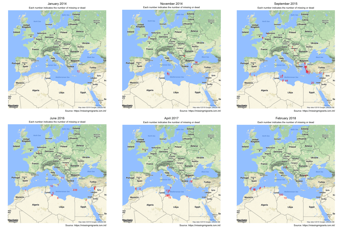
We have all seen photos and videos in the news about desperate people who try to migrate to Europe and have heard about the fatal incidents where hundreds of people died. However, watching the news provides us normally only a short glimpse on a single incident that was horrific enough to make it into the news. We don’t get the full picture until we actually watch on the numbers and visualise them as Fronkonstin has done in his blog post Fatal Journeys: Visualizing the Horror.
Based on the data set from the Missing Migrants project, Fronkonstin shows that most migrants die or get missing in the Mediterranean area. Therefore, I was looking for a way to visualise where in the Mediterranean Sea and in Europe how many people die or get lost. The result is the animated gif below that shows the incidents and their location for each month of the data set. Each number indicates the loss of people of a particular incident.

Animation of the number of missing or dead migrants
To see again how many people die each and every month on their desperate attempt for a better life in Europe is shocking and sad all over again. If we close our borders tighter and make our walls higher in order to save our culture and values from foreign influence through migrants, we let these people die and I don’t know if a culture that does this is worth to be preserved.
For people who are interested in the creation of the animation: It has been done with the R packages ggmap and gganimate. Let me know in the comments if you want the code and I am happy to share it with you.